For some time now I've been frustrated by the visuals and poor functionality offered to me by various investment apps.
These apps are much less interested in answering the question I want answered: what do I actually own, what is it worth and how has it changed over time?
The visuals are clunky, the portfolio views are awkward and the whole experience is currently not that useful to me.
So, now that we're in the age of the custom web, I vibe-coded my own.
The core requirements were simple:
- Display the value of all my holdings in a single view, including P&L.
- Allow me to "buy/sell" holdings and have the overall portfolio value update accordingly.
- Show several different views, including a treemap of the portfolio.
Essentially I wanted a simple, customisable dashboard that brings all my holdings into one place and that shows the value of them accurately, potentially after multiple buys and sells - for some reason most apps don't do this well. The Apple Stocks app is familiar to many and my favourite, but it doesn't show what I own, how much it's worth or the P&L.
Once I decided to build this properly, I needed two things: a reliable list of my holdings and live prices for each.
The Data
Now, I'd love a simple way to get the exact values of my holdings out of various investment accounts, merge them up and consolidate them, but a lack of good APIs and data exports means this isn't possible at the moment, so this will have to be a manual CSV for the time being. If anyone knows a safe, privacy-focused way of doing this, please let me know!
For the live prices, I gave the agent the flexibility to use whatever API it wanted and it sensibly decided to use the yfinance API. I've used this in the past for other projects and it's a reasonably reliable, free way to get the live price of a stock or ETF. It's also well-documented and easy to use, so it's unsurprising that it was the first thing the agent suggested.
The data model was simple enough. The next real challenge was getting this to play nicely within something I could interact with.
The Architecture
I wanted to continue the theme of letting the agent set it's own course for building the app, although I did steer it towards using FastAPI for the backend and React for the frontend. It might well have selected these automatically anyway, but I have experience with them and know for a fact it's seen lots of examples of both, so will be well-equipped to work with them.
The backend is a fairly plain FastAPI app that reads the CSV holdings file, pulls live prices from yfinance and does the arithmetic. Not glamorous, but it gets the job done, which is more than can be said for a lot of infrastructure.
The frontend is a React app with a few different views, because one single consolidated view looks great until you try and glean anything from it. The agent did a great job first pass of setting up the views and components. The styling, however, needed a bit of intervention. I was in the retro mood at the time and opted for a classic Bloomberg-style terminal theme, and after guiding towards this the agent nailed it.
With the plumbing in place, the next question was whether the app could actually feel useful.
The Functionality
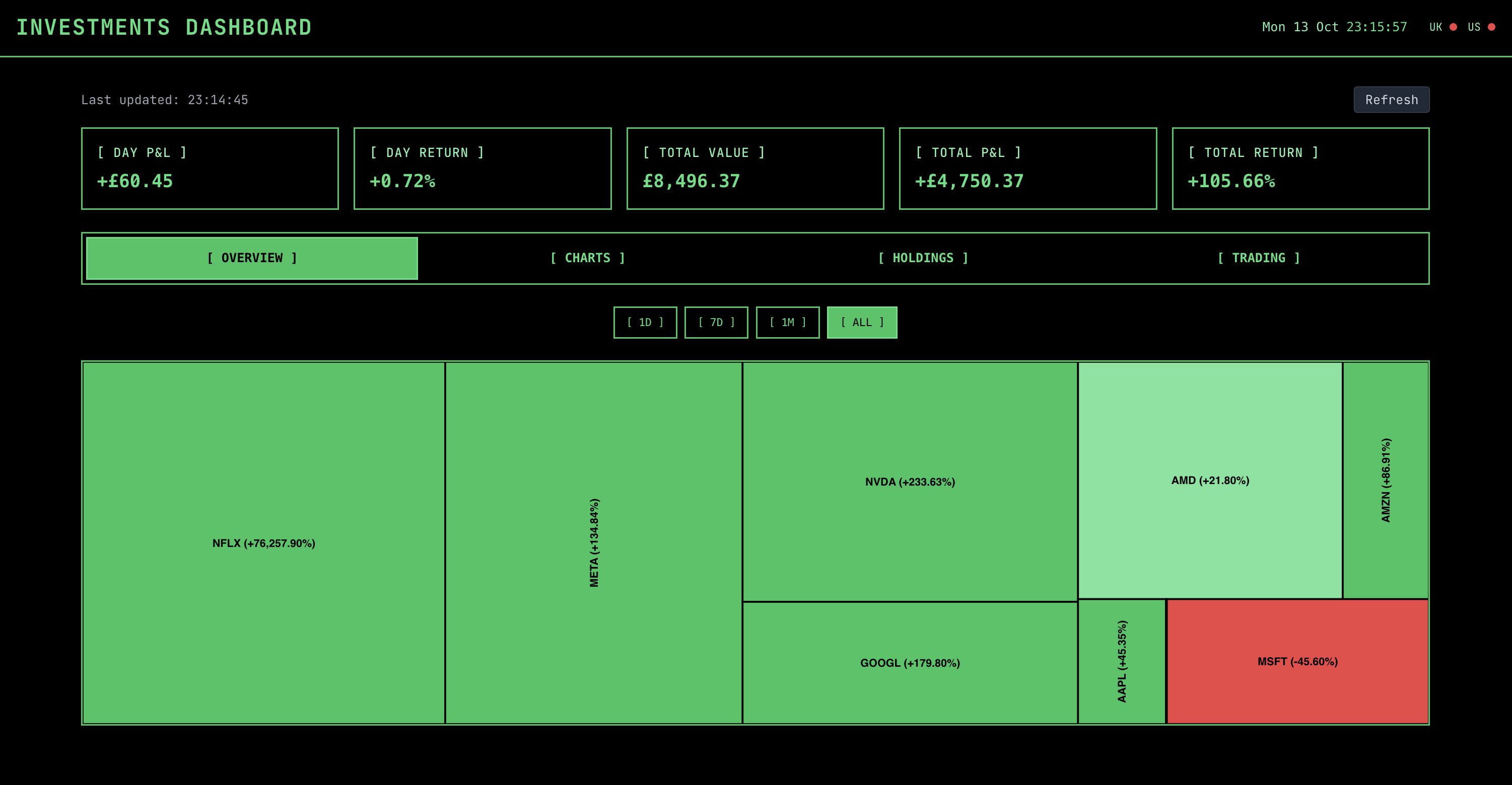
I kept the app deliberately minimal. I wanted something that answered my specific questions well, not another overstuffed dashboard pretending to be indispensable. Therefore at the top of each view are the portfolio headline figures (day P&L, day return, total value, total P&L, total return), each of these are calculated in the backend. To fit the vibe I also added the current date and time to the top right, along with a persistent indicator showing if the UK or US market is open - which turned out to be more useful than I expected.
Once the headline figures were in place, I wanted a few different ways of looking at the portfolio. Each one serves a slightly different purpose based on previous frustrations I've had with other apps.
Portfolio overview
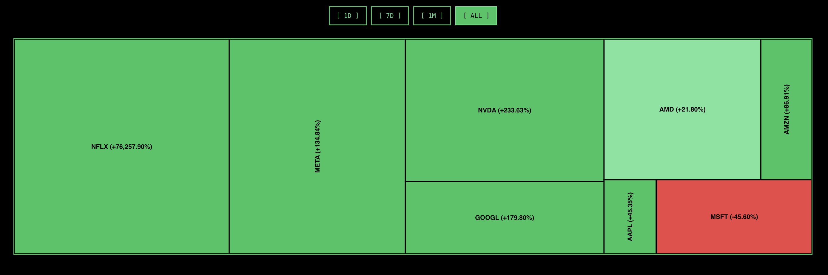
This is the default view and shows a simple treemap of all the holdings, with the size of each rectangle denoting the size of the holding in the portfolio and the colour indicating it's percentage change over the time the filter is set for. Toggling the filter between 1D, 7D, 1M and All changes the colour of the rectangles depending on the return percentage.
The agent created the treemap component using the @nivo/treemap package, which looks pretty good out of the box. I then got the agent to style it to my liking, which was a bit cumbersome.
The treemap gives me the broad shape of the portfolio at a glance, which is very helpful, but it deliberately abstains from the awkward details I sometimes need.
Charts
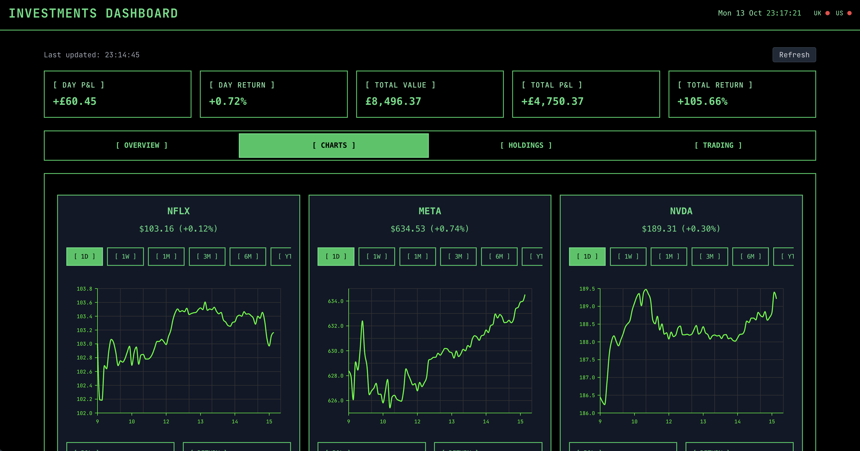
The charts view does what it says. It shows a line chart for each holding, much like you'd see with most other apps, showing the daily price moves of each holding, including their headline information. Below each chart is the P&L for the holding, along with the percentage return for the holding. The charts are filterable individually by time period, from 1D to 20Y, with various increments in between.
These line charts are created using the @nivo/line package and customised to my desired style. I spent far too much time with the agent making them responsive and handling the view on mobile by collapsing
each chart into tabs that expand when selected. The agent managed this, but it was clunky.
The charts show momentum and patterns, which is nice until I realised I still did not actually know what I owned in a clean, boring way. So I wanted a table as well.
Holdings
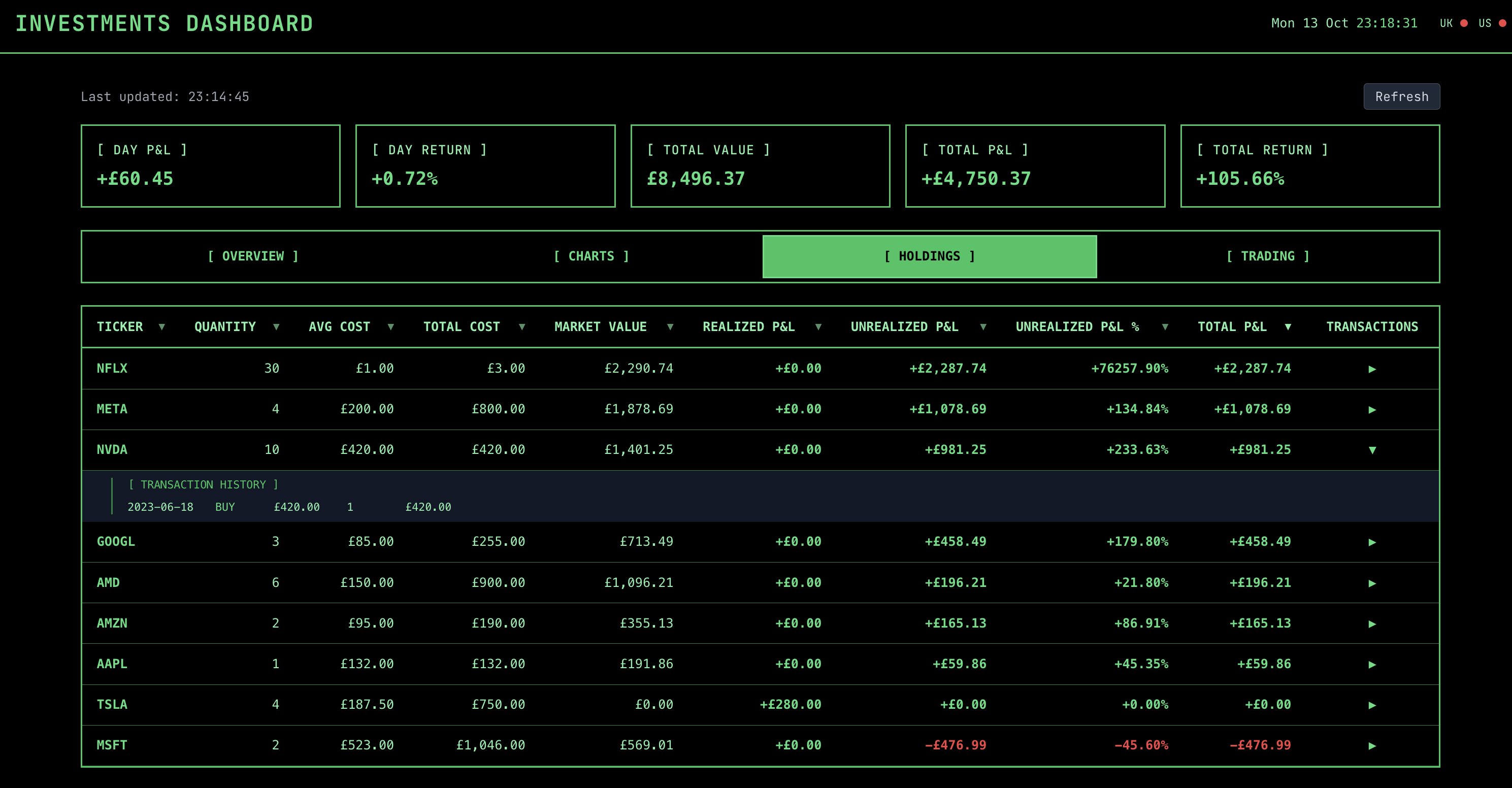
For a raw, straightforward breakdown the holdings view is pretty much all I need. It shows a table of all the holdings, with the ability to sort by various columns, including the ticker, name, quantity, current price, realised P&L, and so on. The agents initial calculations of unrealised and realised P&L were a bit off, so that took a bit of tweaking.
I spent far too much time with the agent making the table responsive and handling the view on mobile by collapsing each row into a tab that when selected expands to show the full row. The agent managed this, but it was clunky. Each row has a simple dropdown menu which shows all the transactions for that holding, i.e., any buys or sells.
Once I could see the portfolio clearly, the obvious next step was to allow me to add and remove holdings from it.
Trading
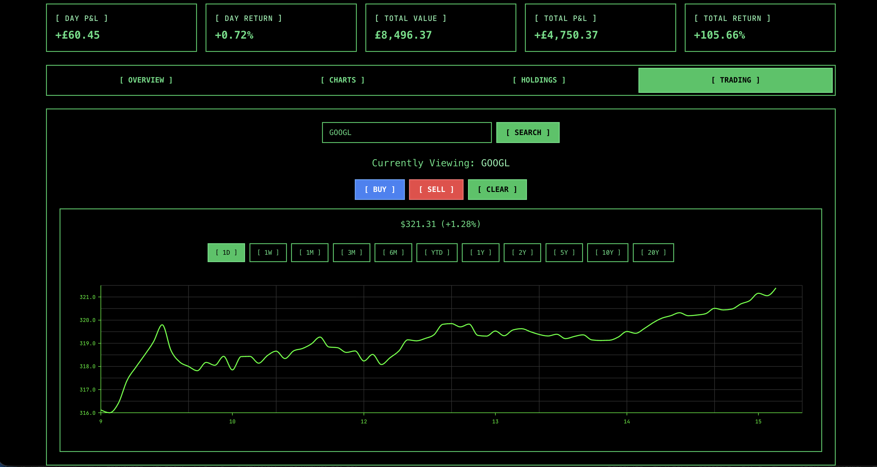
Updating the portfolio is critical for that dynamic feel and the trading view handles this. It provides a simple lookup to search for tickers or companies and add them to the portfolio. When viewing a ticker it simply shows the same chart as in the charts view, just full width, along with the option to buy or sell the holding (if the ticker is already in the portfolio). This brings up a small form to buy or sell a certain number of units. When "transacting" this data is saved to the CSV holdings file in the backend, ensuring the portfolio is kept up to date.
Taken together, these four views don't try to do everything. They just cover the parts I actually cared about.
How Did The Agent Perform?
The app working is all well and good, it's given me a useful tool I needed, but the bigger question is how did the agent perform? Where did it struggle? Where did it shine?
Where "vibe coding" failed and the agent struggled
-
Treemap customisation made the agent wobble.
@nivo/treemapwas clearly less familiar territory than ordinary React components and getting the labels, borders, spacing and colours to behave took far more back-and-forth than I expected. Some of this was my own doing, wanting to get it just right, but it felt like it should have done better. In fact it very much felt like the opposite of the quick CSS wins I saw elsewhere. -
Responsive "collapse" patterns were another weak spot. On smaller screens the tabbed expand/collapse approach technically worked, but felt clunky and took far more iteration than it should have. This was a good reminder that UI patterns involving state and interaction are still noticeably harder than static layouts.
-
P&L calculations were initially wrong. Not catastrophically so, but this is exactly the kind of bug that that's arguably worse in a financial app where accuracy is law. It needed very explicit guidance to fix, which suggests these edge-case-heavy calculations are still not a strong suit.
-
A lot of inconsistency. I tried to avoid reading the code, but on occasion I took a peek under the hood. The app worked, but what I found was messier than it needed to be: inconsistent props, duplicated patterns and "helpful" abstractions I hadn't asked for. The inconsistency was the most noticeable - similar concepts named differently across components, likely because the agent wasn't holding a stable reference for them. The duplication was also frustrating, with the same logic repeated in multiple places instead of being reused, and the abstractions, while well-intentioned, often added more bloat than value. LLMs clearly enjoy writing (often a bit too much) and there's a strange irony in watching a model produce clean, human-shaped prose while generating code that a human may have to spend time unpicking. It works, but it's not especially efficient. In a small project like this it doesn't really matter, and I probably wouldn't have noticed if I hadn't looked, but it's easy to see how these patterns could become a real problem as the codebase grows.
-
Scope creep was constant. The agent was very keen to add extra features, often introducing things I hadn't asked for. This sounds helpful, but in practice it created noise and drifted away from the original goal. I found myself regularly clipping its wings.
-
Performance and time semantics needed intervention. There were redundant API calls, slow portfolio loads and some rough edges around market-open logic. None of it was catastrophic, but seeing prices load slowly because the agent made 12 synchronous API calls wasn't a great sign. It highlighted that efficiency still needed to be actively managed.
That might sound critical, but it would be unfair to stop there. The agent also handled several parts very well.
Where it shone
-
CSS and layout iteration was where the agent felt most comfortable. It handled the retro terminal theme well and was particularly effective at small, iterative tweaks - spacing, alignment, horizontal scroll and cleaning up stray UI issues. This kind of fast feedback loop played directly to its strengths.
-
Scaffolding was another strong point. Standing up FastAPI endpoints, React views and wiring everything together between the CSV, backend calculations and UI was done quickly and with very little friction. This is the kind of repetitive groundwork that normally takes time and the agent removed most of that overhead.
-
Working with mainstream tools came very naturally. Integrating with yfinance and
@nivo/linewas smooth, and it handled the usual chart refinements (e.g., axes, ticks, tooltips and time ranges) without much trouble. When the path is well-documented, it moves quickly and confidently. -
Improving the "live" feel of the app was surprisingly straightforward. The agent stripped out unnecessary reloads, avoided flicker between views and preloaded data in the background, which made the UI feel steady rather than reactive. This had a noticeable impact on how usable the app felt day-to-day.
-
Standard UI features were implemented with very little resistance. The trading flow, tables, sorting, search and transactions all came together quickly. Individually these aren't complex, but getting them all working cohesively would have taken significantly longer to build manually.
-
Asking for a plan before building made a clear difference. Without it, the agent tended to wander; with it, the output was far more aligned with what I actually wanted. Even small adjustments to a plan helped avoid unnecessary rework later on.
So the agent did a great job with certain things too. Taken together I was able to build a usable app quickly and to meet my specific requirements. This is something I now use regularly to keep an eye on things.
Deployment
Once it was reliable enough, the obvious place for it was somewhere always on, quietly doing its job in the background. I have a Raspberry Pi running a few apps and deployed this web app straight to it. I can then access it securely via Tailscale, giving me a private portfolio tracker wherever I am.
Wrapping up
Overall, this project did exactly what I wanted. I now have a simple portfolio tracker that shows me what I own, what it's worth and how it's performing across a few focused views. It's far from perfect, but it's useful, fast enough and, most importantly, built around my own requirements.
It's also a good example of where vibe-coding works well today and where it still falls over. The agent was excellent at getting from zero to a working app quickly, especially with standard backend and frontend patterns, and it handled the styling surprisingly well. But for the more awkward parts - exact calculations, responsive edge cases and keeping things consistent - it still needed a fair amount of steering.
What stood out most was how quickly things drift without that guidance. Left alone, the agent tends toward inconsistency, duplication and a bit of unnecessary complexity. Asking for plans up front helped a lot here - it kept things closer to what I actually wanted and reduced some of that wandering.
If you want to try it yourself, you can pull it from GitHub and run it locally: https://github.com/alfiebeard/investments-dashboard.